MUFG/Union Bank Design System

Bg Mufg

MUFG, the second largest global banking group, engaged our team to help transform their entire software delivery process. As part of the transformation team, I served as senior experience director and product owner leading a cross functional team tasked with bringing consistency, quality, and speed to all experience delivery across the organization and across multiple brands.

Client: MUFG / Union Bank
Roles: Product Owner, User Experience, Strategy

View details on my portfolio site.

Autotrader/Dealer.com Digital Retailing

Autotrader / Dealer.com

Cox Automotive was looking to improve the user experience of their digital retailing channels as well as increase the overall lead conversion and lead quality of their platforms. My team was brought into understand current customer needs and where automotive digital retailing was headed in the future, and then to deliver a brand new experience that would make users happy and comfortable beginning their vehicle purchase process online.

Client: Cox Automotive
Roles: UX Direction, User Research, User Experience, Strategy

View details on my portfolio site.

Fiserv Online Banking Solutions

Fiserv Online Banking Solutions

During a multiyear engagement, we worked with Fiserv on several products within their Online Banking Solutions group. Our team was able to spend time inside users’ homes to truly understand their entire financial journey and use those insights and other research to help guide Fiserv on future product direction and inform a successful product design and launch.

Client: Fiserv, Inc.
Roles: Experience Direction, User Research, User Experience, Strategy

View details on my portfolio site.

Capital One Customer Service App

Capital One logo

Capital One’s Auto Finance group came to projekt202 for help with a complete redesign of their call center agent application to better serve both their customer service agents and their customers. By sitting with agents as they handled inbound customer calls, we were able to understand the biggest pain points and opportunities within the existing application and deliver a new design that allowed for a more powerful, more accurate, and easier to use application.

Client: Capital One
Roles: User Research, User Experience, Strategy

View details on my portfolio site.

BeyondTrust Remote Management App

BeyondTrust

BeyondTrust provides remote support applications that allow tech support employees to remotely connect and fix issues on users’ desktops and mobile devices. Our team was brought in to understand the real world issues help desk employees deal with while servicing their employees or customers and make sure a next gen remote support application made it easier for them to solve problems.

Client: BeyondTrust (formerly Bomgar)
Roles: User Research, User Experience, Strategy

View details on my portfolio site.

PepsiCo Sustainability Portal

PepsiCo logo

Building a more sustainable food system is a key initiative for PepsiCo as global climate change impacts the food supply. We worked with PepsiCo and their farm partners to design a sustainability portal that would make it easy to collect the necessary information from farms to track yearly progress and provide farms and stakeholders insight into the overall program goals and progress.

Client: PepsiCo
Roles: User Research, User Experience, Strategy

View details on my portfolio site.

Fiserv Account Processing Solutions

Fiserv Account Processing Solutions

Designing enterprise applications for use within the high pressure, high security world of the bank branch presented unique challenges when working with Fiserv’s Account Processing Solutions team. Through extensive time in branch, we watched and learned to understand how bank staff serve customers while protecting the security and accuracy of their accounts. That research helped our strategy and design teams translate that care into the software they use to do their jobs.

Client: Fiserv, Inc.
Roles: Experience Direction, User Research, User Experience, Strategy

View details on my portfolio site.

CheapCaribbean Ecommerce Website

Cheap Caribbean logo

CheapCaribbean provides a meta search and custom packages for booking Caribbean vacations. They needed a new responsive design for their entire ecommerce booking and checkout experience that better represented their new branding and helped their customers book just the right vacation.

We worked with the CheapCaribbean team to design a fun, engaging browsing experience that helped users choose their trip based on budget, timing, or what kind of experience they wanted to have. Then we made sure each trip was easy to compare, easy to change dates, and when the user has made their choice, easy to book. With bright colors, witty copy, and the occasional delightful interaction we delivered a design that made the client happy while also meeting users’ needs.

Client: Apple Leisure Group
Roles: User Research, User Experience, Strategy

View details on my portfolio site.

Sabre Flight Logistics App

Sabre

The logistics of making sure the passengers and luggage all end up in the right place is a tough job, making sure the in flight meals are fresh and hot is even tougher. Sabre came to projekt202 to help them design a tool for airlines to manage and plan their catering and food services in the most efficient and cost effective manner possible.

The tool needed to be clear and easy to understand from the fleet level all the way down the individual flight leg, and it had to surface exceptions and issues in a way that any user could diagnose and solve possible issues. With a powerful backend logic engine, the newly designed system allowed users to easily find the information they were looking for and only dive into the details when needed.

Client: Sabre
Roles: User Experience, Design, Data Analysis
Link: Under NDA

FanGuide Mobile Apps

Fanguide Apps

Download on the App StoreFanGuide Apps are iOS apps I designed, developed, and launched to cater to the most rabid sports fans. And do so without looking hideous. I did all the market research for the apps, defined the requirements, and created the UX prototypes and visual design.

Texas Fanguide App screenshot

Project Details

The apps were developed (along with Matt Berg) using Appcelerator’s Titanium framework and they differentiate themselves from the competition with a clean, focused user experience. So far the Texas Longhorn and Alabama Crimson Tide versions of the iOS apps have launched with more teams and Android support coming ASAP.

Sports fans can get all the news on the team they want and never be out of the loop thanks to push notifications on the big stories. The app is also a great game day companion as it provides quick and easy access to the roster for during the games.

Roles: Strategy, User Experience, Design, Titanium Development
Links: Texas FanGuide, Alabama FanGuide

Selected Screens

Plan23 iOS App Icons

FeeCalc app icon

Plan23 Apps was working on a new app idea for a PayPal fees calculator and needed an icon that would be simple and easy to recognize for its function. The final FeeCalc icon was meant to be easily identifiable as a calculator, while also taking design cues from the PayPal logo.

Plan23 liked the icon so much they eventually used the base design with a new color scheme for a new Chipotle nutrition calculator as well. Both versions of the icon stand out great in a sea of apps whether in the App Store or on your phone.

I continue to provide Plan23 both product strategy and UX consulting services as needed.

Client: Plan23 Apps
Roles: Icon Design, Strategy
Link: www.plan23.app

JCPenney Ecommerce

Jcpenney

JCPenney wanted to transform their entire ecommerce shopping experience to keep up with latest industry trends and make their famous deals as easy to use online as they are in-store. By delivering new responsive designs for the site and checkout flows, as well as a new enterprise design system, the team was able to provide not just a new experience for customers but a foundation for future design needs as well.

Client: JCPenney
Roles: User Research, User Experience, Strategy
Link: www.jcpenney.com

Moody’s Investor Services Intranet

Moody's logo

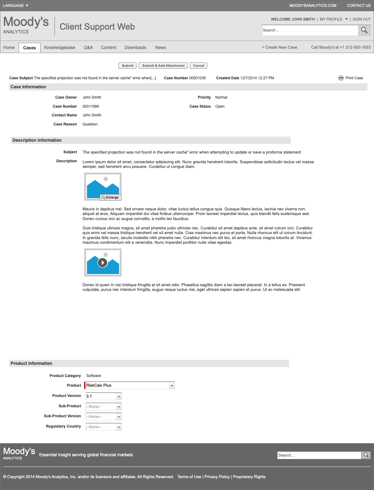
Moody’s was looking to redesign their corportate intranet with the hopes that they could create a site that employees both needed and wanted to use on a daily basis. We talked to key stakeholders and users to understand the features, tools, and services that would be of most value and designed an intranet that met user expectation and leveraged the smart features of Sharepoint to surface the right content at the right time.

Client: Moody’s Investor Services
Roles: User Research, User Experience, Strategy
Link: Under NDA

Selected IA and Wireframes

A selection of key documents and wireframes for the initial site strategy and design.

40 Acres Sports Website and Social Media

40 Acres Sports

40 Acres Sports (formerly BevoSports) was one of the earliest Texas Longhorns sports blogs on the web when I started it back in early 2005. A home for news and opinions on the Longhorns, the site was at one point seeing over 30,000 unique visitors per month at it’s peak.

Roles: Founder, Editor, User Experience, Strategy, Development
Link: www.40acressports.com

40AcresSports screenshots

Project Details

Nullam congue orci non est tempor, in suscipit mi porta. Lorem ipsum dolor sit amet, consectetur adipiscing elit. Nam tempor id arcu sed condimentum. Nullam a tortor eu lacus commodo vehicula commodo a dolor.

Sed tincidunt tristique ligula vel tristique. Aenean rhoncus metus id urna porttitor, non porta mi consequat. Nam sollicitudin lorem diam, eget rutrum nulla aliquet vel. Pellentesque dapibus nulla purus, vitae volutpat urna consequat tempor. Etiam et consequat odio. Nulla facilisi. In nunc lacus, facilisis ut tempor vitae, efficitur ac erat.

40AcresSports Redesign (circa 2011)

With a new name and a new more skeuomorphic design, the site relaunched in 2011 with more resources beyond just the standard blog posts and deeper integration with social media sites including Twitter and Facebook. Fans could now check out the teams’ rosters, recruiting commits, and even look up the upcoming schedule and buy tickets to the game.

Original Design (circa 2007)

The site was originally known as BevoSports.com (before some lawyers got involved) and the original design was essentially a lighter, simpler version of what it would eventually evolve into a few years later. SBNation honored the site with the “Best Looking Blog” award in 2006.