Fiserv Online Banking Solutions

Fiserv Online Banking Solutions

During a multiyear engagement, we worked with Fiserv on several products within their Online Banking Solutions group. Our team was able to spend time inside users’ homes to truly understand their entire financial journey and use those insights and other research to help guide Fiserv on future product direction and inform a successful product design and launch.

Client: Fiserv, Inc.
Roles: Experience Direction, User Research, User Experience, Strategy

View details on my portfolio site.

Capital One Customer Service App

Capital One logo

Capital One’s Auto Finance group came to projekt202 for help with a complete redesign of their call center agent application to better serve both their customer service agents and their customers. By sitting with agents as they handled inbound customer calls, we were able to understand the biggest pain points and opportunities within the existing application and deliver a new design that allowed for a more powerful, more accurate, and easier to use application.

Client: Capital One
Roles: User Research, User Experience, Strategy

View details on my portfolio site.

PepsiCo Sustainability Portal

PepsiCo logo

Building a more sustainable food system is a key initiative for PepsiCo as global climate change impacts the food supply. We worked with PepsiCo and their farm partners to design a sustainability portal that would make it easy to collect the necessary information from farms to track yearly progress and provide farms and stakeholders insight into the overall program goals and progress.

Client: PepsiCo
Roles: User Research, User Experience, Strategy

View details on my portfolio site.

CheapCaribbean Ecommerce Website

Cheap Caribbean logo

CheapCaribbean provides a meta search and custom packages for booking Caribbean vacations. They needed a new responsive design for their entire ecommerce booking and checkout experience that better represented their new branding and helped their customers book just the right vacation.

We worked with the CheapCaribbean team to design a fun, engaging browsing experience that helped users choose their trip based on budget, timing, or what kind of experience they wanted to have. Then we made sure each trip was easy to compare, easy to change dates, and when the user has made their choice, easy to book. With bright colors, witty copy, and the occasional delightful interaction we delivered a design that made the client happy while also meeting users’ needs.

Client: Apple Leisure Group
Roles: User Research, User Experience, Strategy

View details on my portfolio site.

Sabre Flight Logistics App

Sabre

The logistics of making sure the passengers and luggage all end up in the right place is a tough job, making sure the in flight meals are fresh and hot is even tougher. Sabre came to projekt202 to help them design a tool for airlines to manage and plan their catering and food services in the most efficient and cost effective manner possible.

The tool needed to be clear and easy to understand from the fleet level all the way down the individual flight leg, and it had to surface exceptions and issues in a way that any user could diagnose and solve possible issues. With a powerful backend logic engine, the newly designed system allowed users to easily find the information they were looking for and only dive into the details when needed.

Client: Sabre
Roles: User Experience, Design, Data Analysis
Link: Under NDA

JCPenney Ecommerce

Jcpenney

JCPenney wanted to transform their entire ecommerce shopping experience to keep up with latest industry trends and make their famous deals as easy to use online as they are in-store. By delivering new responsive designs for the site and checkout flows, as well as a new enterprise design system, the team was able to provide not just a new experience for customers but a foundation for future design needs as well.

Client: JCPenney
Roles: User Research, User Experience, Strategy
Link: www.jcpenney.com

Moody’s Investor Services Intranet

Moody's logo

Moody’s was looking to redesign their corportate intranet with the hopes that they could create a site that employees both needed and wanted to use on a daily basis. We talked to key stakeholders and users to understand the features, tools, and services that would be of most value and designed an intranet that met user expectation and leveraged the smart features of Sharepoint to surface the right content at the right time.

Client: Moody’s Investor Services
Roles: User Research, User Experience, Strategy
Link: Under NDA

Selected IA and Wireframes

A selection of key documents and wireframes for the initial site strategy and design.

Ann Taylor/LOFT Websites

Ann Taylor | Loft logos

Ann Taylor and LOFT are two of the biggest brands in the country in women’s fashion and they needed new e-commerce websites that would better represent them and better serve their customers.

Ann Taylor / Loft

Project Details

The project was to create a unified user experience with a unified shopping cart so that customers could easily shop both brands. At the time it was designed, it was one of the earliest large scale responsive e-commerce projects from a major retailer. My responsibilities included leading discovery process including many hours of stakeholder interviews, competitive analysis, and customer research. I created all wireframes and medium fidelity prototypes that went through extensive usability testing and iteration.

Client: Ann Inc.
Roles: Discovery, User Research, Wireframes, Prototyping, Usability Testing
Links: www.anntaylor.com, www.loft.com

ATMpass Go-To-Market Strategy and Website

Atmpass

Cardtronics, the world’s largest ATM operator, wanted to introduce a new service called ATMPass into the market aimed at customers who use their ATM cards frequently. Our team helped understand which features of the new subscription service would resonate most with the target audience, develop a go-to-market strategy, and designed a website to serve potential and existing customers.

ATMpass

Project Details

The site needed to be able to simply explain the new concept while also gaining the potential customer’s trust that they could safely provide their personal details and financial info to a company whose name they likely would not recognize.

With a simple design and interactive financial tools, the site succeeded in helping visitors know exactly what they’re looking at and how much money they could potentially save.

The new design encompasses all these goals through a clean, contemporary and informative design with extensive use of videos, sharp imagery, and smart social media campaigns to share the message of membership. Users can log in to view their cost savings, located ATMs, fully manage their account information, gift their friends and family, and access additional savings through local deals with neighborhood merchants.

Client: Cardtronics
Roles: User Research, User Experience, Strategy
Link: www.myatmpass.com (archive link)
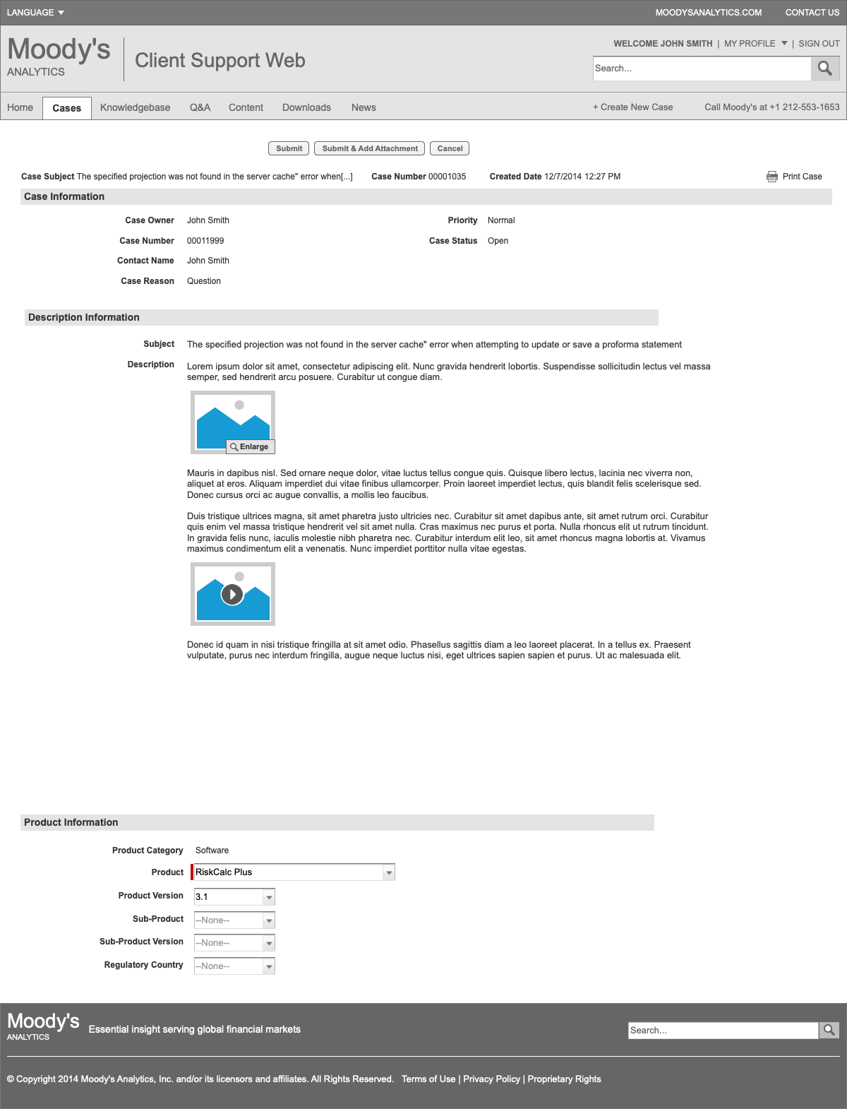
Selected Wireframes

A selection of key documents and wireframes for the initial site strategy and design.

Final Designs

Examples of the final design deliverables.

National Notary Association Website

National Notary Association logo

The largest notary company in the country, NNA requested a website redesign to make the complex process of becoming a notary more clear and easy to follow.

The new website offered a more open, clean and organized design that quickly located what state you wanted to apply in and guided you through an easy step-by-step application process that assisted you in the training, package details, insurance, membership and e-Commerce supplies section, along with a logged-in membership portal that tracked your commissions and status. The updated design was fully responsive, allowing you to get everything completed on your desktop, tablet, or mobile device.

Client: National Notary Association
Roles: Discovery, Responsive Wireframes, Prototyping, Usability Testing
Link: www.nationalnotary.com

Safety-Kleen Website

Safety-Kleen

Safety-Kleen is the leading provider of environmental services to commercial, industrial and automotive customers and the largest re-refiner of used oil in North America. They needed a new website that helped them better reach customers in two disparate markets while doing a better job of demonstrating how they helped customers to Make Green Work©.

Roles: Discovery, User Research, UX Strategy, Sitemap, Wireframes, Development
URL: www.safety-kleen.com

Safety-Kleen website screenshotProject Details

I started on this project long before it closed as I was extensively involved in the sales process. Once we got the desired signatures, my roles on the project included leading the discovery process, stakeholder interviews, UX research and competitive analysis, and creating the site’s information architecture including sitemap and wireframes.

Analysis included user personas, a deep analytics review, lead generation strategies, and content, marketing, and technical recommendations surrounding knowledge gained from key stakeholders. This analysis fed into the site’s responsive wireframes and the design phase. For this project I was also involved with the front-end development, primarily writing custom styles to enable and optimize the mobile view of the site.

Selected Wireframes