
The UX of LEGO Interface Panels

Dating back 50 years at this point, LEGO has designed tiny little user interfaces meant to be recognized by human-sized humans and “usable” by minifig-sized humans as well. An Austrian interaction technologist and design engineer does a fantastic deep dive into the design of LEGO interface panels as well as their real world counterparts.
Reimagining a Self Ordering Experience

Some great thoughts and looks into the design process self-serve pizza ordering kiosk app.
Very Large Touchscreens: UX Design Differs From Mobile Screens

Starting a kiosk project at work and diving into some of the best practices and details of designing for a gigantic touchscreen. This article on how designing for a large public touchscreen is alike and different from mobile was super informative.
Top 10 Application-Design Mistakes

Top 10 Application-Design Mistakes from Nielsen Norman Group. Application usability is enhanced when the UI guides and supports users through the workflow.
First Run UX
First Run UX is catalog of first run user experiences in mobile apps and other products curated by Krystal Higgins. Great resource for inspiration and best practices to make sure new users to your app hit the ground running.
Hamburger menu alternatives for mobile navigation
Hamburger menu alternatives for mobile navigation. My personal favorite has always been “Priority+” which this article calls a “progressively collapsing” menu. Really makes you focus on the top 3-4 most important items.
Dropdowns Should be the UI of Last Resort

Some great details and examples from Luke W. of optimizing web forms for mobile entry. Main focus of this article is that standard dropdowns should be the UI of last resort. Going with a mobile-optimized option like a toggle, steppers, or custom solution can simplify mobile forms and improve conversation rates.
Tesla Apple Watch app

Eleks Labs has written up a really interesting look at their Tesla Apple Watch app. The walkthrough of the process and technical details is a good read for anyone interested in doing their own Apple Watch work. Both their UX decisions and workarounds due to technical limitations seem like they’re going to be valuable lessons.
UX Check Google Chrome extension
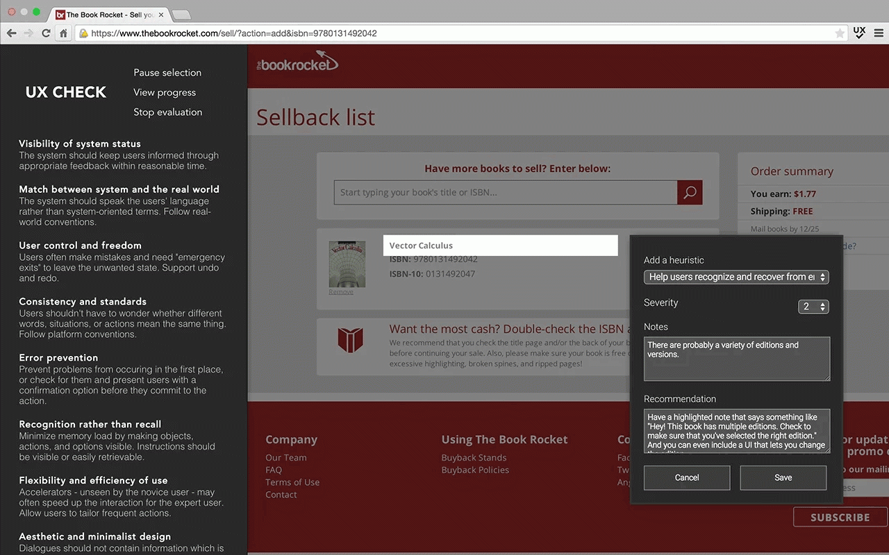
Interesting tool. UX Check is a Chrome Extension that helps you identify usability issues through a heuristic evaluation.